Responsive web design involves more than just adjusting layouts for different devices; it also requires thoughtful typography that scales seamlessly across screens. Typography plays a pivotal role in user experience, readability, and overall design aesthetics. Ensuring text remains legible and visually appealing across various devices is a significant challenge. This is where a “Responsive Font Size Calculator” becomes an invaluable tool.
Responsive Font Size Calculator
Understanding Responsive Typography Calculator
The Challenge
Designing typography that adapts gracefully to different screen sizes while maintaining readability and visual hierarchy can be complex. A font that looks perfect on a desktop may become too small or cramped on a mobile device, affecting user experience.
The Solution: Responsive Font Size Scale Calculator
Enter the Responsive Font Size Calculator—an intuitive tool designed to simplify the process of determining font sizes for different devices. This calculator uses base font sizes and scaling ratios to compute optimal font sizes across various breakpoints, ensuring consistent and readable typography.
How Type Scale Works Based on Viewport (Not Fluid Typography)
1. Base Font Sizes
The calculator starts with input for the base body font size and base H1 tag size—the foundation for typography across the website.
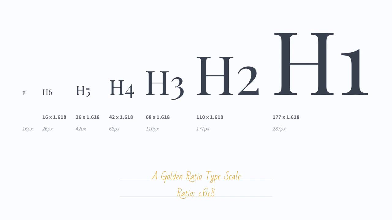
2. Scaling Ratio Calculation
The scaling ratio defines the relationship between different heading sizes and the base font size. It ensures a harmonious progression in font sizes as the hierarchy descends.
3. Calculating Font Sizes
Upon inputting these values, the calculator computes font sizes for headings (h1 to h6), body text, buttons, and navigation for desktop, tablet, and mobile breakpoints.
Advantages of Using the Responsive Font Size Calculator
Consistency Across Devices
Maintaining consistent typography ensures that users have a similar reading experience regardless of the device they use. The calculator’s output helps maintain this consistency.
Readability Enhancement
By dynamically adjusting font sizes based on the device, readability is enhanced. Users can comfortably consume content without straining their eyes.
Simplified Design Process
Designers and developers can streamline their workflow by effortlessly determining font sizes for different breakpoints, saving time and effort.
Responsive Font-size Typography for your website
Responsive typography is a fundamental aspect of creating user-friendly and visually appealing websites. The Responsive Font Size Calculator serves as an essential tool in achieving this goal. By seamlessly scaling font sizes across devices, it empowers designers and developers to create captivating and readable content across various screens.
Mastering responsive typography is key to crafting exceptional user experiences, and with the aid of tools like the Responsive Font Size Calculator, achieving this goal becomes more accessible and efficient.
This calculator isn’t just about sizes—it’s about ensuring that every word on a website is legible, engaging, and harmoniously presented, regardless of the device it’s viewed on.
Crafting responsive typography involves balancing aesthetics, readability, and functionality. The Responsive Font Size Calculator embodies this philosophy, enabling creators to deliver exceptional typography tailored to every device.